Monsanto Westinghouse's 2007 NY Times/LA Times Recap
The 10 Best Books of 2007
Design by Paul Sahre; photograph by Tony Cenicola
Fiction
MAN GONE DOWN
By Michael Thomas. Black Cat/Grove/Atlantic, paper, $14. This first novel explores the fragmented personal histories behind four desperate days in a black writer’s life.
OUT STEALING HORSES
By Per Petterson. Translated by Anne Born. Graywolf Press, $22. In this short yet spacious Norwegian novel, an Oslo professional hopes to cure his loneliness with a plunge into solitude.
THE SAVAGE DETECTIVES
By Roberto Bolaño. Translated by Natasha Wimmer. Farrar, Straus & Giroux, $27. A craftily autobiographical novel about a band of literary guerrillas.
THEN WE CAME TO THE END
By Joshua Ferris. Little, Brown & Company, $23.99. Layoff notices fly in Ferris’s acidly funny first novel, set in a white-collar office in the wake of the dot-com debacle.
TREE OF SMOKE
By Denis Johnson. Farrar, Straus & Giroux, $27. The author of “Jesus’ Son” offers a soulful novel about the travails of a large cast of characters during the Vietnam War.
Nonfiction
IMPERIAL LIFE IN THE EMERALD CITY: Inside Iraq's Green Zone.
By Rajiv Chandrasekaran. Alfred A. Knopf, $25.95; Vintage, paper, $14.95. The author, a Washington Post journalist, catalogs the arrogance and ineptitude that marked America’s governance of Iraq.
LITTLE HEATHENS: Hard Times and High Spirits on an Iowa Farm During the Great Depression.
By Mildred Armstrong Kalish. Bantam Books, $22. Kalish’s soaring love for her childhood memories saturates this memoir, which coaxes the reader into joy, wonder and even envy.
THE NINE: Inside the Secret World of the Supreme Court.
By Jeffrey Toobin. Doubleday, $27.95. An erudite outsider’s account of the cloistered court’s inner workings.
THE ORDEAL OF ELIZABETH MARSH: A Woman in World History.
By Linda Colley. Pantheon Books, $27.50. Colley tracks the “compulsively itinerant” Marsh across the 18th century and several continents.
THE REST IS NOISE: Listening to the Twentieth Century.
By Alex Ross. Farrar, Straus & Giroux, $30. In his own feat of orchestration, The New Yorker’s music critic presents a history of the last century as refracted through its classical music.
===========
Holiday Books
Comics
The Führer is on the loose in “I Killed Adolf Hitler,” left, by the Norwegian artist Jason, while the wordless “Fox Bunny Funny,” by Andy Hartzell, concerns desire, utopianism and socialization in a world populated by foxes and rabbits.
Cartooning is always subjective, so when you look at political comics, it’s useful to think about where their arguments can lie — not just in their words but in the implications of their visual style. If you were to read only Andrew Helfer’s text for RONALD REAGAN: A Graphic Biography (Hill & Wang, $16.95), for instance, it would seem to be a straightforward chronological trot through Reagan’s life story, with particular attention paid to the showmanship of his public persona and his weakness for self-serving fabrications. Most of the book’s spin, though, is actually in its artwork, by Steve Buccellato and Joe Staton. After an opening montage of notable moments from Reagan’s public life, which might as well have been sketched from publicity photos, “Ronald Reagan” becomes a catalog of the sorts of visual rhetoric cartoonists can pull off: nearly every panel incorporates some kind of broad caricature or symbolic distortion, usually at Reagan’s expense. On a single page, we see a smiling Reagan hobnobbing with three other Screen Actors Guild board members while Jane Wyman checks her watch; then Reagan and Wyman sweating, smiling and pushing away enormous tough guys with shirts labeled “Union”; then a quizzical Reagan (with a question mark over his head) watching a man with a fez and a hammer-and-sickle jacket whispering in someone’s ear; and finally the editorial-cartoon shorthand of an eagle and a bear standing on a broken swastika and scowling at each other.
Skip to next paragraph
That sort of visual ricocheting among multiple varieties of exaggeration and abstraction, combined with the time leaps required to squeeze Reagan’s career into 100 pages of comics, makes for disjointed storytelling, and there’s scarcely a panel here that leads directly to the next. Buccellato and Staton’s caricatures often resemble a rushed version of Mort Drucker’s movie parodies from MAD magazine; if Helfer’s words skewer Reagan at every opportunity, they don’t overtly burlesque him the way the pictures do. (Caption: “By the end of July, the budget and tax-cut portions of Reaganomics had become law, setting the stage for the Reagan administration’s ‘new beginning.’” Image: a beaming sun with a big, sarcastic smiley face on it, rising over the Capitol building.) Virtually all the dialogue in “Ronald Reagan” is drawn from the public record, and Helfer crams in a remarkable amount of information, but it’s the images that pass judgment.
The veteran underground cartoonist Sharon Rudahl, conversely, is unabashedly a fan of her new book’s subject and draws her with a reverent lightness of touch. A DANGEROUS WOMAN: The Graphic Biography of Emma Goldman (New Press, paper, $17.95) is largely based on “Living My Life,” by an even bigger Goldman buff: Goldman herself, the anarchist activist who spoke out on behalf of pretty much every revolutionary cause of her time and never missed an opportunity to come off like a martyred champion of the oppressed. Most of the text, Rudahl notes, is drawn from the writings of Goldman and her circle, although she seems to have added quite a few exclamation points herself (“It sounds like the awakening of the American worker!!”).
That’s somehow fitting, and so is Rudahl’s madly anarchic, hyperdramatic visual approach. Her images, executed in feathery line work with ink wash, drape all over one another. Faces and bodies are uniformly bulbous and wobbly. The sole consistent design element is Goldman’s hair, a bun-shaped mass of pointillist speckles. (Every page, distractingly, is signed by Rudahl with a little copyright notice.) The book briskly catalogs the particulars of Goldman’s life, lingering on only a few episodes, like Alexander Berkman’s failed 1892 attempt to assassinate the steel plant manager Henry Clay Frick and the 1920 visit to Russia that turned Goldman against Soviet Communism. For the most part, Rudahl represents scenes as they might have happened, although she throws in an occasional daffy gesture, like Karl Marx quotations coming from the mouths of the Marx Brothers. She sometimes grants herself a broader perspective than her subject’s, too: every time we see Goldman taking a new lover, the look on her face suggests her attention is wandering elsewhere, as if she’s already thinking about how to make her paramour part of her legend.
Rutu Modan’s EXIT WOUNDS (Drawn & Quarterly, $19.95) isn’t directly concerned with politics, as such, but the political culture and social stratification of modern-day Israel are intimately connected to the emotional violence its characters inflict on one another. Numi, an Israeli soldier, contacts a young Tel Aviv taxi driver named Koby to tell him that an unidentified body from a suicide bombing may have been his long-absent father, Gabriel. This isn’t an official notification, though: Gabriel had been Numi’s lover, and she needs Koby’s help to find out if he really is dead or has simply abandoned her. As the two of them investigate Gabriel’s disappearance, everything Koby learns compounds the stack of lies that made up his father’s life. Ultimately, he finds himself in an impossible position, so fenced in by emotional violence that no course of action seems defensible or even prudent.
Modan helped found the Actus Tragicus collective of Israeli cartoonists, and the plot of her first graphic novel is shrewdly constructed, feinting at obvious twists (like the inevitable romance between the rich girl and the poor boy who’ve been bickering for most of the story) and then swerving away from them. But the real glory of “Exit Wounds” is Modan’s artwork. Her characters’ body language and facial expressions, rendered in the gestural “clear line” style of Hergé’s Tintin books, are so precisely observed, they practically tell the story by themselves. Numi, for instance, spends most of the story slouching a little, as if she’s trying to hide her height; you can tell she’s got her guard down when she straightens up. And Modan’s Israeli landscapes, colored in flat, solid tones, capture the look of the country with spare precision: a few fluid lines describe a dingy bus-station cafeteria or a scrubby beach, echoing the book’s treacherous interpersonal terrain, where everything and everyone has sustained collateral damage.
The single-named Norwegian cartoonist Jason’s dryly riotous I KILLED ADOLF HITLER (Fantagraphics, paper, $12.95) concerns the ultimate political act: changing the course of history, or trying to. Jason’s brief, whimsical graphic novels maintain a tone of deadpan stasis in the face of the most ludicrously over-the-top plot devices; last year’s “Left Bank Gang” was about the struggling cartoonists F. Scott Fitzgerald, Ezra Pound and James Joyce deciding to pull a bank heist, and this one follows a hit man, exhausted by the day-to-day drudgery of his work, who is hired to take a time machine to 1938 and assassinate der Führer. (As always, Jason draws all of his characters with animal heads — rabbits, dogs, birds — and flat, blank facial expressions.)
Jason’s minimal drawings, dominated by empty space, and his laconic pacing imply that nothing particularly significant is going on, although there is near-constant gunplay, Hitler is on the loose in present-day Berlin, and World War II is about to be eradicated from history. The effect is something like “Grindhouse” as rewritten by Harold Pinter. Nearly every page includes at least a panel or two of characters silently sitting around, waiting for something to happen, which it usually doesn’t. If you’re expecting “I Killed Adolf Hitler” to be the huge sci-fi action epic it first promises to be, the book’s best joke is on you — Jason gradually nudges the story off its path until it comes to rest as a low-key romantic comedy. And the jacket features the greatest author bio in recent memory: “Jason was born in Norway in 1965. Suddenly he spoke to a cat. Winter filled the room. They could see the ocean.”
Skip to next paragraph
Enlarge This Image
“Ronald Reagan: A Graphic Biography,” by Andrew Helfer, Steve Buccellato and Joe Staton.
Enlarge This Image
“Exit Wounds,” a graphic novel set in modern-day Israel, by Rutu Modan.
Andy Hartzell’s first graphic novel, FOX BUNNY FUNNY (Top Shelf, paper, $10), uses comics’ “funny animal” tradition more schematically, for a wordless, deliciously mannered fable about desire, socialization and utopianism. In the opening sequence, he sketches out a jolly culture of humanoid foxes that’s firmly grounded on the oppression of the weak. Fox society, you see, is totally dedicated to the torture and destruction of bunnies — their ice cream cones are topped with severed bunny heads, their video games are first-person chompers about catching and devouring bunnies, and their rite of passage into adulthood involves venturing into bunny territory to commit indiscriminate slaughter. The book’s nameless fox protagonist has a terrible secret: he’s haunted by his longing to grow long ears and a fluffy tail, eat carrots and hop. As much as he tries to suppress his rabbity tendencies and be a real fox, he knows what he truly is inside.
Hartzell’s narrative glides along so smoothly that it can take a few readings to notice how clever and nuanced his design sense is. The contrast between the black foxes and the white bunnies lets every page’s composition serve the book’s thematic arc. Twenty years or so pass between the second and third chapters, which he gets across through nothing more than a change in his cartoon fox’s build. There are wicked comedic details everywhere, like the little fox ears atop the foxes’ cars; the two cultures’ written languages (paw prints for foxes, pictures of leaves for bunnies); and the hints that the core of the bunny religion is acceptance of suffering and death in the hope of divine vengeance.
The story’s climactic vision of an integrated fox/bunny (or “funny”) society, which Hartzell begins by abandoning his steady six-panels-a-page rhythm for two enormous double-page images, is a jewel of design and comedy: the city in which the species coexist still eroticizes violence, but as fantasy rather than brutal reality. You can even read that as a political allegory, if you like.
Douglas Wolk is the author of “Reading Comics: How Graphic Novels Work and What They Mean.”
=======================================================================
The Decade That Won’t Die
Photograph from "The Great Funk"
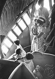
An airliner by Calder.
By JOE QUEENAN
Published: December 2, 2007
There are three kinds of revisionism. Marshaling cunning arguments to prove that James Polk is a vastly underrated president is tendentious but doable. Trying to convince skeptics that James Carter is a vastly underrated president is willfully contrary. Contending that James Buchanan is a vastly underrated president is flat-out nuts. But of the three, arguing that Buchanan should be up there on Mount Rushmore is by far the most fun, because if you’re going to be a revisionist, you might as well swing for the fences.
Skip to next paragraph
THE GREAT FUNK
Falling Apart and Coming Together (on a Shag Rug) in the Seventies.
By Thomas Hine.
Illustrated. 241 pp. Sarah Crichton Books/Farrar, Straus & Giroux. $30.
Related
First Chapter: ‘The Great Funk’ (December 2, 2007)
Enlarge This Image
Photograph from "The Great Funk"
Eclectic clutter
Enlarge This Image
Photograph from "The Great Funk"
The AMC Pacer.
Enlarge This Image
Photograph from "The Great Funk"
Amana tried selling refrigerators with a choice of decorative panels.
In “The Great Funk: Falling Apart and Coming Together (on a Shag Rug) in the Seventies,” Thomas Hine, the widely published design critic and author of “Populuxe,” has adopted a cautious, sensible approach to re-evaluating our most maligned decade. Rather than speciously contending that the 1970s were a great period in American history — the way pop historians like to argue that the Huns and the Vandals were classy chaps victimized by negative Roman spin, or that Phil Collins rocks — Hine simply suggests that the ’70s were not as bad as most people think. Conceding that the ’70s were characterized by bad hair, bad clothes, bad music, bad design, bad books, bad politics, bad economics, bad carpeting, bad fabrics and a lot of bad ideas, he reminds us that the decade was nonetheless the spawning ground for many of the attitudes and values that define our society today. This is neither a radical nor an original theory — we all know that feminism, gay rights and a morbid obsession with fuel efficiency grew out of the ’70s — so in the end Hine has succeeded in writing a thoughtful, fair but somewhat derivative book about an era that was completely outrageous. A wild and crazy guy, he is not.
In a certain sense, Hine has exhumed a cadaver that was never interred. Because of cable TV, an innovation that really took off in the 1980s, “Charlie’s Angels,” “The Mary Tyler Moore Show,” “All in the Family,” “Sanford and Son,” “Maude” and “The Jeffersons” have never gone away; nor have disco (“Saturday Night Fever: The Musical”), punk (Ramones regalia everywhere), heavy metal (Ozzy Osbourne), bell-bottoms (“That ’70s Show”) or Abba (“Mamma Mia!”). Like the absurdly mythologized ’60s, the reliably clownish ’70s have never been given space to recede into the past the way the ’40s did, in part because ironic hipsters (“The Simpsons”; “Family Guy”; the concept of “jumping the shark,” inspired by the Fonz) are forever going back to heap fresh ridicule on an era no one ever took seriously. Reading “The Great Funk” is like revisiting a nightmare many of us never awoke from in the first place.
Reasonably comprehensive, if not encyclopedic, and filled with pictures that are worth thousands of the author’s words, “The Great Funk” covers most of the major bases: Watergate, the energy crisis, hot pants, drugs, “Deep Throat,” polyester, revolting facial growth, “Star Wars,” Day-Glo baseball uniforms, the Village People, Carlos Castaneda, big hair, streaking, Bobby Riggs versus Billie Jean King, gay rights, geodesic domes, Jim Jones, “Jonathan Livingston Seagull,” midi-skirts, the decline of classy cars, the rise of Gerald Ford. Unlike the ’60s, dominated by charismatic politicians, the ’70s were dominated by crooks and nebbishes, so it was pop culture that set the national agenda. That culture was narcissistic and silly, its values immortalized in Charles A. Reich’s enormously popular “Greening of America,” the book that best captures the apocalyptic fruitiness of the era. In a passage defending that book, Hine sets forth the central thesis of his own work:
“Reich’s mistake was to interpret minor, transient phenomena as bellwethers of permanent, positive change. Bell-bottoms were, he said, a way of expressing personal freedom, the delight and beauty of movement, and a rather comic attitude toward life. He wasn’t wrong about that, but he seemed to think that people would be wearing bell-bottoms forever.”
Seemingly relieved that this did not come to pass, Hine continues:
“Yet the book does not deserve the derision with which it is often remembered. Though much of his evidence for a cultural revolution proved to be fleeting, Reich nevertheless identified some important and lasting changes in the society. He saw that what emerged in America during the late ’60s was not, as many believed, a political movement, but a social and cultural one. ... The openness to experience and respect for differences that Reich observed became so much a part of the American ethos that, today, it’s obligatory to say you share such values, even if you don’t.”
And thus, compassionate conservatism.
Hine, strong on fashion, architecture and design, is weak in other areas. He does not seem to understand that a society that worships both David Bowie and Carole King is not a monolithic one, that “Rocky” — which he never mentions — is a far more important movie than “Logan’s Run” or “Soylent Green,” that the plot of “Jaws” is probably not heavily influenced by public disillusionment with politicians. He elevates Dolly Parton to a questionable role as a feminist icon and ignores John Denver, whose career cast a long, dark shadow over the entire decade. An even more notable omission is Hunter Thompson, the second-most gifted journalist of the period (after Tom Wolfe, who named the ’70s “the Me Decade”). He also leaves out Muhammad Ali, Joe Frazier, the Eagles — whose “Greatest Hits” is the best-selling record in history — and EST, and, blinded by his enthusiasm for the dapper men’s fashions in Francis Ford Coppola’s “Godfather” movies, he overlooks that same director’s potent Watergate allegory, “The Conversation,” one of the most chilling films ever made. It’s not that Hine gets everything wrong; it’s more that he omits or sloughs off a number of things it would have helped to get right.
Breezy and glib, “The Great Funk” works nicely as a guide for those too young to remember the 1970s, those who may be surprised to learn that young I.R.S. agents actually wore Fu Manchus to work, that leisure suits were not initially viewed as a joke, that gas rationing really and truly occurred in this great nation, that Jimmy Carter and Gerald Ford actually lived in the White House — a possible explanation for the rampant substance abuse at the time — and that the soccer moms who brought them into the world may have once worn Ultrasuede hot pants. Though he never minimizes the bizarre atmosphere of the era, Hine never captures the widespread feeling that America had taken a totally wrong turn in the ’70s.
And though he wisely discusses the rise of evangelical Christianity and mentions that George W. Bush was at Yale the same time as Charles Reich, he never truly grapples with the fact that despite all those doobies and Allman Brothers mustaches that trickled down from Berkeley and Harvard Yard to Main Street, most people in the United States were not experiencing the ’70s in quite the same way that Cher, Harry Reems, Larry Flynt, Ziggy Stardust and Buckminster Fuller were. The 1970s began with a mildly conservative president in the White House. The 1980s got going with an even more conservative president at the helm. Without Watergate, a conservative candidate would have won in 1976. Proving that not everybody wanted the funk, not everybody wanted the noise.
Joe Queenan writes for Barron’s, The Los Angeles Times and The Guardian.
======================================================
Basics
An Ancient Medicine (Enjoy in Moderation)
By NATALIE ANGIER
Published: December 11, 2007
Every year, the average American adult drinks the equivalent of 38 six-packs of beer, a dozen bottles of wine and two quarts of distilled spirits like gin, rum, single malt Scotch, or vodka that aspires to single malt status through the addition of flavors normally associated with yogurt or bubble bath.
Skip to next paragraph
Serge Bloch
We are by no means the most bibulous people: according to the World Health Organization, 39 other nations outdrink us, a list topped by Luxembourg, where residents manage to ingest roughly 284 bottles of beer and 88 bottles of wine annually, no doubt to salve the indignation of explaining that their country isn’t part of Belgium.
Yet even though we Americans drink less than some others, we can hold our own, especially now that the peak ethanol season is under way. Liquor sales in December, according to hospitality trade groups, are usually a good 50 percent higher than in other months, and that’s hardly a surprise. December is a time of multicreedal spirituality and festivities, and alcohol has been a fixture of celebration and religious ritual since humans first learned to play and pray. December is also cold, dark and miserable, a meteorological migraine begging for home remediation, and alcohol is perhaps humanity’s oldest medicine.
Moreover, December is a time for family, and a taste for alcohol, it seems, is all in the family, the extended phylogenetic family of primates and other animals that make fruit a centerpiece of their diet. Nothing broadcasts the presence of ripe, digestible fruit as effectively as the aroma of fermentation. We’re frugivores at our core.
“As far back as we can look, humans have had a love affair with fermented beverages,” said Patrick McGovern, an archaeological chemist at the University of Pennsylvania. “And it’s not just humans. From fruit flies to elephants, if you give them a source of alcohol and sugar, they love it.”
Humans may have an added reason to be drawn to alcohol. Throughout antiquity, available water was likely to be polluted with cholera and other dangerous microbes, and the tavern may well have been the safest watering hole in town. Not only is alcohol a mild antiseptic, but the process of brewing alcoholic beverages often requires that the liquid be boiled or subjected to similarly sterilizing treatments. “It’s possible that people who drank fermented beverages tended to live longer and reproduce more” than did their teetotaling peers, Dr. McGovern said, “which may partly explain why people have a proclivity to drink alcohol.”
Dr. McGovern and other archaeologists have unearthed extensive evidence of the antiquity and ubiquity of alcoholic beverages. One of the oldest known recipes, inscribed on a Sumerian clay tablet that dates back nearly 4,000 years, is for beer. Chemical traces inside 9,000-year-old pottery from northern China indicate that the citizens of Jiahu made a wine from rice, grapes, hawthorn and honey, a varietal recently brought back to life by the intrepid palates at Dogfish Head brewery in Delaware. Last month, Dr. McGovern, John S. Henderson of Cornell University and colleagues reported evidence in The Proceedings of the National Academy of Sciences that the earliest known chocolate drink, made from the cacao plant in Honduras 1,400 years ago, was probably a fermented beverage, with an alcohol content similar to beer, a discovery that brings to mind the classic Onion T-shirt: “I’m like a chocoholic but for booze.”
Researchers caution, however, that if we humans are congenitally inclined to drink, we are designed to do so only in moderation. We are not, in other words, Syrian hamsters, the popular pet rodents that also are a favorite of alcohol researchers. Syrian hamsters are the Andy Capp of the animal kingdom. “They’ll drink alcohol whenever offered the option,” said Howard B. Moss, associate director for clinical and translational research at the National Institute on Alcohol Abuse and Alcoholism in Bethesda, Md. “You give them a bottle of water and a bottle of alcohol, they’ll always choose the alcohol over the water.”
Researchers have traced this avidity to the hamster’s natural habits. The animals gather fruit all summer and save it for later by burying it underground, where the fruit ferments. “That’s how the hamsters find their cache of last summer’s goodies when it’s the middle of winter,” Dr. Moss said. “They’ve developed a preference for the taste and smell of fruit that’s turned.” They’ve also developed the necessary equipment to metabolize high doses of alcohol. “A hamster’s liver is five times the size of a human liver in comparison to the other abdominal organs,” Dr. Moss said. “It’s all liver in there.”
Behind the hamster dance is the ancient chemical legerdemain of fermentation, which by its most general definition means extracting energy from sugar without using oxygen. There are many ways to do this: our muscle cells ferment when operating anaerobically, say, while lifting weights. The fermentation that yields ethanol, the type of alcohol we drink, is the work of yeast cells, which will latch onto any suitable sugar source and start feasting. As they break down the sugary chains, the yeast enzymes generate two key byproducts: carbon dioxide, which can be used to puff up bread dough, and ethanol. Alcohol, then, is nothing more than fungal scat.
Ah, but how that scat can sing. An alcohol molecule consists of a knob of hydrogen and oxygen linked to a carbon-based stalk, and that telltale knob, that hydroxyl group, allows the molecule to mix easily with water. “The hydroxyl group makes alcohol go to any cell in the body that has water,” said Samir Zakhari, director of the division of metabolism and health effects at the alcohol institute, “which means alcohol goes to every tissue in the body.”
The brain is particularly well lubricated, and alcohol happily mingles therein, to noteworthy, crazy-quilt effect. It stimulates the secretion of dopamine, the neurochemical associated with the brain’s reward system. It stifles the brain’s excitatory circuits and excites the brain’s dampening circuits. It alters the membranes of neurons and the trafficking of important ions like calcium and sodium across neuronal borders. It stimulates like cocaine and it depresses like valium. It makes the shy voluble, the graceful clumsy and the operator of a motorized vehicle very dangerous.
As always, the dose makes the poison, so as you savor the season, take it one small sip at a time.
========
Not Pretty
Review by AMY FINNERTY
Published: December 2, 2007
In “History of Beauty,” Umberto Eco explored the ways in which notions of attractiveness shift from culture to culture and era to era. With ON UGLINESS (Rizzoli, $45), a collection of images and written excerpts from ancient times to the present, all woven together with a provocative commentary and translated by Alastair McEwen, he asks: Is repulsiveness, too, in the eye of the beholder? And what do we learn about that beholder when we delve into his aversions? Selecting stark visual images of gore, deformity, moral turpitude and malice, and quotations from sources ranging from Plato to radical feminists, Eco unfurls a taxonomy of ugliness. As gross-out contests go, it’s both absorbing and highbrow.
Skip to next paragraph
Multimedia
A Conversation With Umberto Eco (mp3)
Enlarge This Image
Christ’s martyrdom earns a chapter. By the late Middle Ages, we learn, he was being depicted as a flesh-and-blood human, contorted in pain. Fifteenth-century masterworks share space here with Mel Gibson’s lacerated, cinematic Christ. Eco asserts that while such a sight may be moving to some Christians, it might equally be sickening to a Buddhist or a Hindu.
Eco’s lexicon of all things repellent is exhaustive, including the “obscene, repugnant, frightening, abject, monstrous,” the “fetid, fearsome, ignoble, ungainly” and more. The wicked might fall under his heading “Witchcraft, Satanism, Sadism” or “The Ugliness of Woman From Antiquity to the Baroque Period.” With expertly chosen paintings from the 18th and 19th centuries, he demonstrates how images pretty to us might have stirred up misogynist anxieties not so long ago. Giacomo Grosso’s “Supreme Meeting” (1894) depicts comely women, cavorting naked, strewn with flowers. The painting makes Eco’s ugliness cut because the women depicted are Satanists, hence repugnant and threatening to the moral order. Their very seductiveness might have excited fear of unbridled female potency — just the thing to prompt a shudder, a reflex inherent to any definition of ugliness.
The author includes several excerpts that tell us how deep are the roots of this fear. According to the Malleus Maleficarum (1486), the malevolence of witches arises from “carnal lust, which is insatiable in them.” (Suggesting how much attitudes have evolved, the text goes on to thank the Almighty for sparing males such character flaws.) The idea that ugly is as ugly does held sway for some in the third century, when Tertullian argued that a pretty face became ugly when exposed to the extramarital gaze. In “Women, Wear a Veil,” he inveighed against lipstick, rouge and hair coloring, telling matrons, “Don’t worry, O blessed ladies, no woman is ugly to her own husband; she was pleasing enough when she was chosen.”
But 2,000 years before Botox, in the first century, Martial had harsher words for mature women. “You walk around with a forehead more wrinkled than your stole / And breasts like cobwebs; the Nile crocodile / Has a tiny mouth compared with your maw.” For some, the decline of youth and fertility was hard on the eyes — and the nose. Elderly women were singled out for particular ridicule in a 13th-century commentary (“Smelly Old Lady”) and another from the 15th century (“Malignant Old Woman”). But Lucretia Marinelli’s “Nobility and Excellence of Women,” from 1591, is a bold counterattack: “I say that all men are ugly compared with women; therefore they are unworthy of being loved.”
Poverty and illness cause some to avert their eyes, as does The Other, whose ethnicity or dress may place him in a minority within a society. Fascist material, like Gino Boccasile’s anti-Semitic postcard from 1943-44, was used to illustrate the imagined moral inferiority of its subjects, as manifest in their physical features. But holding a mirror up to the propagandists, and proving what a malleable conceit ugliness was and is, Eco writes that “the facial features, the voice and the actions of the ‘ugly’ Jew became ... unequivocal signs of the moral deformity of the anti-Semite.”
Readers may strain to discern categorical ugliness in some of Eco’s chosen artworks and passages. In the chapter “Romanticism and the Redemption of Ugliness,” he includes turbulent — but therefore all the more lush — landscapes, and an Emily Brontë passage describing the smoldering Heathcliff, whose “forehead, that I once thought so manly, and that I now think so diabolical, was shaded with a heavy cloud.” By Eco’s criteria, anything stirring, or not utterly conventional and saccharine, would seem to merit inclusion in an encyclopedia of the off-putting.
Yet, in his analysis, the intentionally disharmonious can be anointed as a thing of beauty. By the 20th century, with “The Avant-Garde and the Triumph of Ugliness,” jarring forms, as exemplified by those of Picasso, became central to an artistic creed that would have baffled the ancients, just as it did many gallerygoers of the day. Happily for readers, Eco chooses images — hundreds of them — as adroitly as his words, demonstrating the power of art to elevate even the most pitiable subject. “Ugliness can be redeemed,” he writes, “by a faithful and efficacious artistic portrayal.” He includes an image of a first-century statue of an aged “market lady.” The decrepit crone becomes a paragon when carved in stone and placed in the Metropolitan Museum of Art.
Ugliness can also be redeemed by human relationships and individual choice, even in this vapid age of Most Beautiful People lists. Inner virtue counts, and we may defy aesthetic guidelines when deciding where we’d most like to rest our eyes. The message in Domenico Ghirlandaio’s “Portrait of an Old Man With His Grandson” (circa 1490) seems to be that love is blind. The old man has a deformed face, but the little boy seems oblivious to any defect as he gazes up, entranced, into his grandfather’s eyes.
=============
Visuals
“Vietnam Zippos,” by Sherry Buchanan.
Review by STEVEN HELLER
Published: December 2, 2007
War is hell! Yet in James Aulich’s WAR POSTERS: Weapons of Mass Communication (Thames & Hudson, $40), a lush catalog for a current exhibition at the Imperial War Museum in London, many of the posters produced in favor of armed conflict and in opposition to it during the 20th and early 21st centuries are so exquisitely conceived and rendered that they can be appreciated as art, not mere propaganda.
Skip to next paragraph
For instance, there’s a 1918 British “Buy War Bonds Now” poster by an anonymous designer that almost prefigures Abstract Expressionism. Another from the same war bond campaign shows a sliver of a circular British airplane insignia that is so minimalist it resembles ’60s Op Art. A “war savings certificate” poster from 1918 with the title “Now, Back the Bayonets” turns otherwise menacing weapons into orange blades of grass against a psychedelic yellow field.
Some posters obscured the horrific realities of war, like Ludwig Hohlwein’s “Appeal for the War-Disabled” (1918), whose picture of an infirm soldier leaning on a crutch is so stylishly painted it underplays the trauma of being a casualty. The 1945 British poster “On to Japan!,” by Sevek, showing a muscular figure aiming an airplane in the shape of a bow and arrow at Japan, has a beautiful Art Deco veneer that would have given the viewer a sense of pride in the inevitable bloody struggle ahead. Elegant graphic mannerisms in posters for World Wars I and II helped lull people into accepting a sanitized illusion.
Most posters promoting warfare conformed to a set of codes and styles designed to persuade viewers to act on their atavistic behaviors. “For Spain, One, Great and Free” (1936-39) is rendered in a monumental style that reinforces the notion that warfare is heroic and warriors are supermen. Yet when it came to depicting the enemy, posters used demonic images to instill fear and loathing. In N. Shukov and Viktor Semenovich Klimashin’s “Beat the German Beasts!” (1943) and P. Sarkisyn’s “Let’s Kill the Hydra!” (1941-45), the enemies are portrayed as vile creatures that meet with violent retribution from bayonet and sword.
Above all, war demands loyalty, so a poster like David Stone Martin’s “Above and Beyond the Call of Duty” (1943), a moody portrait of an African-American sailor wearing his Navy Cross, was designed to recruit troops from a segregated segment of society. Abram Games’s surreal storybookish illustration for “Grow Your Own Food” (1942) encouraged British citizens to sacrifice and do their part for the war effort. Cautionary posters in factories were commonplace, and comedy was useful for grabbing attention. The German “Shame on You, Chatterbox! The Enemy Is Listening. Silence Is Your Duty” (1943) and the American “Don’t Be a Sucker! Keep Your Mouth Shut” (1942-45) use similar styling and comic characters (a duck and a big-mouthed fish) to push the message home.
Most of the book contains posters that were produced to support war efforts. The final chapter, titled “The Cold War and the New World Order,” lumps together more recent protest images, from the Vietnam and Iraq wars, in which satire is the principal weapon. “Is This What You’d Call ‘Phased Withdrawal’?” (circa 1968) shows a photograph of flag-draped coffins (today, of course, the United States government tries to keep images of dead soldiers from the public). Other examples of strident humor include Tomi Ungerer’s poster “The Americans Are Coming” (1967), which features a drawing of a Vietnamese Paul Revere, and the now famous “iRaq” parody of an Apple advertisement, which shows a silhouette of the hooded Abu Ghraib prisoner attached to electrodes — except here the wires are those of an iPod.
While it’s useful to include oppositional work, this chapter feels tacked on. In fact, better integration of pro- and antiwar posters from all the periods covered (and there was graphic protest against both world wars) would have offered more useful comparisons.
Other than a few sophisticated TV commercials for America’s volunteer armed forces, the Iraq war to date has generated mostly protest graphics, a majority of which can be found on the street. In STREET ART AND THE WAR ON TERROR: How the World’s Best Graffiti Artists Said No to the Iraq War (Rebellion/Trafalgar Square, $35), edited by Eleanor Mathieson and with text by Xavier A. Tàpies, American foreign policy is visually skewered around the globe. The primary mediums are stencil and spray paint, but stickers, decals and poster paste-ups are also common. Most of the barbs are aimed at George W. Bush — including one from Sydney, Australia, inspired by Andy Warhol’s Elvis as a cowboy, with W.’s face superimposed, and another from San Francisco with the headline “Elect a Madman, You Get Madness” — but Donald Rumsfeld (“Secretary of Offense”), Dick Cheney and Tony Blair share the heat. Much of the art is anonymous and ranges from highly detailed representations to graffiti scrawls (“U.S. Army Go Back Home”) on a concrete blockade in Baghdad. Most of the artists are unknown or known by noms de crayon because so few guerrilla artists sign their work. Still, some have become well known, including Robbie Conal, Shepard Fairey, Dolk and Banksy.
Street art of this kind is usually illegal and, especially in American cities, is often removed within hours or days. Yet in other countries where American policy is criticized, the duration of the display can be considerably longer, though never permanent. This book will be the only record for most of the pieces here and therefore an invaluable document.
Skip to next paragraph
Enlarge This Image
“War Posters: Weapons of Mass Communication,” by James Aulich.
Enlarge This Image
“Massin,” by Laetitia Wolff, top, and “Transit Maps of the World,” by Mark Ovenden.
For grunts fighting the Vietnam War, statements of patriotism and protest found an outlet not on posters but on metal Zippo lighters. VIETNAM ZIPPOS (University of Chicago, $25), illustrated with objects from the collection of the artist Bradford Edwards, documents what the author, Sherry Buchanan, calls “amulets and talismans bringing the keeper invulnerability, good luck and protection against evil.” Sadly, these personalized mementos also served as last testaments for many who were killed in action.
Cigarette lighters with unit insignia were common during World War II, but during the Vietnam War the graphics were often those of the counterculture. In addition to displaying combat slogans, many Zippos were emblazoned with peace symbols, the Zig Zag Man rolling paper trademark, cartoon characters and “sex scenes worthy of the Kama Sutra,” Buchanan writes. They were sold at PXs and custom-engraved with “slogans, mantras, poems and obscenities” at stalls in Vietnamese villages. They also became infamous when soldiers were filmed during a search-and-destroy mission using their lighters to burn down huts.
An extensive published record exists for documents and relics from the Vietnam War, yet this book, well designed and photographed by Misha Anikst, offers a rare personal dimension. The mottoes on these lighters, like “When I die I will go to heaven because I spent my time in hell,” provide candid insight into what these soldiers thought of the war.
Marijuana was plentiful in Vietnam, which is why a fair number of Zippos had engravings of the ubiquitous Zig Zag Man (a symbol of rebellion). Although Zig Zag may have been the paper of choice for soldiers and hippies, José Lorente Cascales’s ROLLING PAPER GRAPHICS (Gingko, $24.95) shows it was but one of hundreds of brands produced since the end of the 18th century. “The origins of cigarette rolling paper booklets can be traced back to a Dominican priest, Father Jaime Villanueva Estingo (Jativa, Spain, 1765 — London, 1824),” the author writes. Not all papers were used for marijuana. In Father Villanueva’s day, tobacco smokers laboriously and wastefully cut sections of large sheets of paper to roll their cigarettes. He devised a more convenient method of peeling small sheets from pocket-size booklet dispensers.
By the mid-1800s rolling papers were big business, and many were produced throughout the world, distinguished by unique graphic motifs. While a few of the variations in this book will be recognizable to pot connoisseurs, an overwhelming majority are unfamiliar (and no longer used). Like other small-scale commercial graphic artifacts from the late 19th and early 20th centuries (razor blade wrappers, matchbox covers), many of these were adorned with fanciful decorative typography and exotic images. This book adds another interesting subchapter to graphic design history.
It’s no surprise that not a single rolling paper graphic is found in Stephen J. Eskilson’s GRAPHIC DESIGN: A New History (Yale University, $65). These ostensibly anonymous graphics are arcane compared with the more standard works of design that have had an impact on the larger visual culture. In their attempt to establish a field of serious graphic design scholarship, historians (and I have written a few of these design history books myself) focus on building a canon of essential works as opposed to ephemeral ones like rolling papers.
Eskilson, an associate professor of art history at Eastern Illinois University, is the latest historian to produce an omnibus graphic design history. “A History of Graphic Design,” by Philip B. Meggs, was published in 1983; the fourth edition was posthumously published in 2005 and is the standard textbook. “Graphic Design: A Concise History,” by Richard Hollis, was published in 1993, and “Typography and Graphic Design: From Antiquity to the Present,” by Roxane Jubert, came out in 2006. These four books more or less include the same fundamental information, presented with slightly different organizing principles. Each focuses on the major movements and practitioners to show how graphic design (or commercial art) both influenced and influences fine art and other forms of design.
Although it’s impossible for redundancy not to reign, each author brings a singular perspective. As an art historian, Eskilson looks at design from the art perspective more than the others do, which is valuable because design does indeed intersect with art movements. Yet while his 464-page book is smartly written, it fails to provide enough of a novel lens through which to view the same artifacts and ideas.
One of the high points in Eskilson’s book, however, is the attention paid to the “signage and visual identity” of the London transport system and to Harry C. Beck’s innovative map (1931-33) of the London Underground. Long celebrated as the first example of a modern transport map, it has influenced scores of others. But to see how it really stands up, one will have to read Mark Ovenden’s TRANSIT MAPS OF THE WORLD (Penguin, paper, $25).
While navigating this jampacked book can be a tad confusing, the overall effect is more than impressive. Ovenden does what no other design history book has ever done: he visually chronicles the evolution of the New York subway — the world’s largest — from its 1905 map, with only a few train lines, to the intricate 1948 version, which is barely legible, to the much-criticized 1972 Massimo Vignelli diagram map, which evolved into the current version. For this alone, “Transit Maps of the World” is a must-have.
Oddly, there is no mention of Robert Massin (known only as Massin) in “Graphic Design: A New History.” He is a major typographer and the subject of a new monograph, Laetitia Wolff’s MASSIN (Phaidon, $75). Emboldened by the computer, which easily gives letters an elastic quality, today’s typographers often use typefaces the way we use paint or clay, expressively modeling and contorting them to challenge meaning and convey feeling. Yet way back in 1964, Massin, a French book and book-jacket designer and a virtuoso of expressive typography, used real elastic, among other materials, to stretch typefaces. For one of his many experimental interpretive works, a “re-creation” of “La Cantatrice Chauve” (“The Bald Soprano”), the absurdist “anti-play” by Eugène Ionesco, he composed the entire dialogue and stage directions in numerous, often jarring typefaces to represent different characters in conversation. He also variously enlarged the text to approximate the timbre of their respective voices and merged it all with high-contrast photographs of the cast. Since digital technology was not available, Massin laboriously rendered by hand all of the text using adhesive-backed transfer type on strips of elastic and vellum, resulting in distortions that gave each spread its own kinetic verve. The result was so extraordinarily dynamic that it became an archetype of visual bookmaking, prefiguring the recent spate of graphic novels.
Dozens of other typographical feats are presented in “Massin.” While not all of his books were radically experimental, this former designer for major French book clubs enlivened the publishing industry by testing the limits of typographic composition. He also reintroduced vintage and passé wood typefaces in totally novel ways, rooted in a Dadaist spirit. Although Massin (who was born in 1925) and his typographic work have been little known over here, in the ’70s his books on the history of quirky letter forms and odd compositions, notably “Letter and Image,” were virtually required reading for designers. Wolff’s copiously illustrated and detailed professional biography does justice to a great talent who is still designing.
Massin is featured in an omnibus of a different kind, AGI: Graphic Design Since 1950 (Thames & Hudson, $65), edited by Ben Bos and Elly Bos. In this 800-page Who’s Who, samples of work by Massin and hundreds of others from around the world, including A. M. Cassandre, Saul Bass, Milton Glaser and Tibor Kalman, are reproduced with brief biographies. A.G.I. (Alliance Graphique Internationale) is an elite invitational organization of international graphic designers, founded as a community, who meet annually in different countries to share their work and aspirations — a veritable pantheon of designers. Far from being a mere membership directory, this book is an adjunct to existing histories. While it does not include critical analysis of the members’ work, “AGI” offers a sampler of some of the most distinctive graphic design, typography and illustration. It serves as a record of accomplishment and will doubtless provide future scholars with a road map of who did what in the last half of the 20th century and the early part of the 21st.
Another omission from “Graphic Design: A New History” is Aaron Douglas (1899-1979), an African-American painter and book-jacket designer who created a startling array of stylized images for books of the Harlem Renaissance (including “The Black Venus,” by André Salmon) as well as magazine cover lettering and illustrations. Had he been involved with some of the white-dominated design organizations, he might have been better remembered in design histories. Fortunately, in AARON DOUGLAS: African American Modernist (Yale University/Spencer Museum of Art, University of Kansas, $60), edited by Susan Earle, his stunning drawings, paintings, typography and woodcuts are reprised. Although much of his graphic work, notably a 1926 series of illustrations for Eugene O’Neill’s play “The Emperor Jones,” is decidedly of its time, it reveals a stylistic approach that many designers and illustrators employ today.
Popular culture has produced so many images that the omnibus design histories might be forgiven for not chronicling them all. What’s more, depending on who is doing the chronicling, some will be ignored on purpose. In ICONIC AMERICA: A Roller-Coaster Ride Through the Eye-Popping Panorama of American Pop Culture (Universe, $60), by Tommy Hilfiger with George Lois, more than 400 artifacts, signs, symbols, inventions and ideas — from arts and crafts to people and places — are encyclopedically chronicled and annotated. Hilfiger, the noted fashion designer, and Lois, the legendary ad man, have chosen famous corporate logos like the Prudential rock and the Nike swoosh. Also featured are the classic varsity jacket and the Hawaiian shirt, both part of America’s great ephemera — and its love affair with pop. Rather than vegetating in front of the television, take a look at “Iconic America.” It offers hours of fun, and part of the enjoyment comes from pondering what Hilfiger and Lois left out.
=================
Gleefully Upsetting the Artistic Apple Cart
By WILLIAM GRIMES
Published: November 21, 2007
Spoiler alert: The hero dies at the end, but shed no tears. Modernism, the artistic revolution that began with the poetry of Charles Baudelaire in the 1840s and quietly expired in the 1960s with Andy Warhol’s Brillo boxes, enjoyed “a good long run.” So Peter Gay concludes in the final sentence of “Modernism: The Lure of Heresy From Baudelaire to Beckett and Beyond,” his sweeping survey of the poets, playwrights, painters and architects who set out to rewrite the rules of art, transform consciousness and, wherever and whenever possible, shock the complacent middle class.
Skip to next paragraph
Janet Malcolm/W. W. Norton
Peter Gay
MODERNISM
The Lure of Heresy From Baudelaire to Beckett and Beyond
By Peter Gay
Illustrated. 610 pages. W. W. Norton & Company. $35.
Related
Featured Author: Peter Gay
Actually, Mr. Gay points out, that complacency has been greatly exaggerated. All revolutions require an enemy. The Modernists found theirs in the bourgeoisie, a fat, convenient target but also a source of support and encouragement. Enlightened curators, like Alfred Lichtwark at the Hamburg Kunsthalle, and art dealers like Paul Durand-Ruel in Paris, helped prepare the ground for the eventual victory of Modernism’s disorganized troops.
“Businessmen of culture offered and sold artistic products, whether dramas, drawings or volumes of poetry, and with the same gesture advanced the aesthetic cultivation of the buying public,” Mr. Gay writes. The road was long and difficult, but never quite as lonely as the artists themselves often saw it. Their isolation, was, in part, a self- created myth. “If my work is accepted,” John Cage once said, “I must move on to the point where it is not.”
Mr. Gay, the eminent historian of the European Enlightenment, Weimar culture and Sigmund Freud, has spent the greater part of the 1980s and ’90s chronicling the sensibility and cultural life of the Victorian middle class in his five-volume series, “The Bourgeois Experience.” It makes some sense, then, that he should now turn to the artistic avant-garde dedicated to pulling the rug from under the oppressive father figures of the 19th century. Otherwise it is hard to locate the motivation for yet another general work on a movement whose every breath and gesture has been subjected to minute study by legions of historians.
Mr. Gay adds little new in what amounts to a college survey course. A graceful writer, he leads the reader on a pleasant ramble through a well-traveled landscape, pointing right and left to the prominent features along the way and, like a superbly informed guide, offers his thoughts and comments. From seminal figures like Baudelaire and Flaubert, he moves right along to the Impressionists and then, taking the various art forms in turn, advances chronologically through the great debacle wrought by fascism and World War II before wrapping up with such postwar phenomena as Abstract Expressionism and Pop Art.
He has a thesis. Modernism, he argues, was propelled by two main impulses: the urge to overturn established hierarchies and break rules — this is what he means by “the lure of heresy” — and a compulsion to explore the artist’s interior world. These primal drives produced “a single aesthetic mind-set,” a “climate of thought, feeling and opinion,” unifying what might appear to be a scattering of disconnected artistic revolts.
Armed with this pair of organizing principles, Mr. Gay sets forth down his well-traveled highway. Prodigiously well informed, he covers a broad expanse of ground quickly, touching on most of the major figures but also bringing in lesser names, like the German playwright Georg Kaiser, who make the great galaxy of Modernism twinkle a little more brightly. Smart bits of description (the Guggenheim Museum as a fat white oyster) and well-chosen anecdotes speed the narrative merrily along, but rarely does Mr. Gay heed the greatest Modernist injunction, attributed to Sergei Diaghilev: “Astonish me!”
Mr. Gay’s enthusiasms and his insights are unevenly distributed. On painting, especially 19th-century painting, he rarely rises above banality. Edvard Munch, a second-rater by most estimations, gets promoted to the first rank, largely because his psychological obsessions dovetail with Mr. Gay’s Freudianism.
Literature, music and architecture, especially the pioneering architectural and design work of the Bauhaus movement, bring out his most insightful writing. Mr. Gay, in the chapter “Eccentrics and Barbarians,” takes a bit of a detour to profile wayward figures like Charles Ives and Knut Hamsun, the “anti-modern modernists.” These are the most engaging pages in the book, offering shrewd analyses that reveal how easily Modernism could embrace retrograde political thinkers and the seeming paradox, in the case of Ives, of an artistic revolutionary and small-town philistine inhabiting the same man.
The Freudian tinge lends a distinctive coloration to familiar material. Mr. Gay does have the odd habit of checking in from time to time to see what Freud thought of this or that Modernist, to no particular purpose. But he also delivers a splendid Freudian interpretation of Kafka’s work as embodying displaced conflict with his father. He also calls T. S. Eliot sharply to account, rejecting Eliot’s assertion that the poet hovers, detached, above the poem, an impersonal artificer. As implicated in Modernism’s interior voyage as any other poet, “Eliot was wrong.”
After World War II, Mr. Gay finds “much talent and little genius.” Pop Art’s erasure of distinctions between high and low art, crucial in his mind to the Modernist project, spelled the end of the great human adventure that began a century or more earlier. But Mr. Gay is not quite ready to sign the death certificate, especially after a visit to the Guggenheim Museum in Bilbao, Spain, designed by Frank Gehry. A twitch here, a jerk there, and who knows? There may indeed be life after death.
========================================================================================
Books of The Times
More on the Career of the Genius Who Boldly Compared Himself to God
(Picasso)
======
'Zeroville'
By STEVE ERICKSON
Reviewed by LIESL SCHILLINGER
The hero of Steve Erickson’s new novel is obsessed with movies.
By LIESL SCHILLINGER
Published: December 2, 2007
Ahh, the lure of the madman — the harrowed, sinewy figure with glowing eyes who approaches out of the shadows, burning to communicate his incommunicable truth. Think of Jack Nicholson in “The Shining” with his wild stare and lurking ax: “Heeeeeere’s Johnny!” When such a person nears, do you step back? Do you linger, frozen in terror, compelled by his mesmeric gaze? Or do you, like Vikar, the “cinéautistic” protagonist of Steve Erickson’s latest novel, “Zeroville,” regard him quizzically, without fear, thinking only, “I don’t understand comedies”?
Skip to next paragraph
ZEROVILLE
By Steve Erickson.
329 pp. Europa Editions. Paper, $14.95.
Related
First Chapter: ‘Zeroville’ (December 2, 2007)
Erickson, the film critic for Los Angeles magazine, writes surreal, highly visual novels that he splices together as if they were art films. Two of his earlier books, “The Sea Came In at Midnight” and “Our Ecstatic Days,” feature the same symbolic heroine, Kristin, a young woman who bears a child named Kierkegaard (Kirk for short) to an “apocalyptologist” in Los Angeles, only to have the child disappear as the city is inundated by magical portents — a lake fills the valley, owls swirl overhead and invisible “melody snakes” infest the skies.
Yes, Erickson likes to mess with his readers’ heads. But that’s nothing compared with what he’s done to the head of Ike Jerome (known as Vikar to his friends because of his divinity-school background and mystic mien), the troubled, visionary hero of the fascinating piece of phantasmagoric Hollywood homage that is “Zeroville.” Vikar’s shaved head is covered with a tattoo of Montgomery Clift and Elizabeth Taylor, “the two most beautiful people in the history of the movies,” their lips nearly touching in a close-up from “A Place in the Sun.” Strangers who meet Vikar recoil from the skin cartoon that stains his cranium, but unless you offend the flesh and blood (or celluloid) people Vikar loves, you’re safe. In the words of the Clash, one of the punk bands he listens to, “Everybody say, ‘He sure look funny.’ / Ah but that’s Montgomery Clift, honey!”
The story takes place between 1969 and the early ’80s, following Vikar from Los Angeles to Madrid to New York to Cannes, even to Oslo, and back. But as one of the characters, a director called Viking Man, observes, “It’s all Hollywood, everywhere is Hollywood, the only place on the planet that’s not Hollywood anymore is Hollywood.” While narrating Vikar’s journey in a fairly linear chronology, interrupted by flashbacks, Erickson weaves in fleeting references to actual actors, directors and rock bands. He allows Vikar to spy on Ali McGraw flubbing her lines as she shoots “Love Story”; to party in a beach house with the young Robert DeNiro in his pre-“Taxi Driver” days; and to happen upon CBGB’s at the dawn of its punk heyday.
Nearly a decade ago, the longtime executive editor of Premiere magazine, Peter Biskind, recapped the same era in his nonfiction book “Easy Riders, Raging Bulls: How the Sex-Drugs-and-Rock ’n’ Roll Generation Saved Hollywood.” “Zeroville,” with its dizzying, in-the-know, name-and-place dropping (and its incessant allusions to famous movies and their stars, both cryptic and explicit) is a kind of novelistic refutation of Biskind’s book — without an index. Its very title is a cinematic inside joke, drawn from the New Wave Godard film “Alphaville.” In that movie, the private eye cries, “This isn’t Alphaville, this is Zeroville!” Vikar, with visions of “Blade Runner” zipping through his head, thinks Hollywood is Zeroville because “there’s no sunlight in this Los Angeles; every day is reset at zero,” and “the movies have been reset at zero.” For him, that isn’t necessarily an indictment, since “the movie is in all times, and all times are in the movie.”
Both Biskind’s and Erickson’s books begin with the Manson murders and an earthquake. Vikar arrives in Los Angeles in August 1969 on a bus from Philadelphia, determined to bring his visual sensibility to the film business and haunted by family memories. (His Bible-spouting father crept into his bedroom to rage about sin, on one occasion while brandishing a long knife.) Vikar quickly makes an impression on his fellow Angelenos: his tattoo is an unforgettable calling card. When a hippie at a sandwich shop mistakes the tableau on his head for a scene from “Rebel Without a Cause” and says, approvingly, “Dig it, man. My favorite movie,” Vikar smashes him with his tray, incensed that anyone could mistake Liz for Natalie, Monty for James Dean.
A couple of days later, Vikar is the one brought to ground when a dozen cops charge him as he emerges from the Harry Houdini house in Laurel Canyon, a ruin amid burning caves in the Los Angeles hills. By ill luck, Vikar has taken his hillside stroll on the morning after the Manson family slaughters, and his body art makes him look like Public Enemy No. 1. Still, he’s regularly employed building sets at Paramount, and Viking Man reassures his friends that although Vikar is “nuts about movies,” he’s not a violent cult member. Even freaky, groovy actors aren’t entirely convinced, particularly Soledad Palladin (rumored to be the daughter of Luis Buñuel) whom Vikar reveres. “He may not be one of the Manson family,” she admits. “But he’s not harmless.”
Beyond establishing these (somewhat) grounding details, it’s simply impossible to explain the intent and direction of this funny, disturbing, daring and demanding novel — Erickson’s best. The set pieces in “Zeroville” are particularly breathtaking. It’s hard to read the scene in which Vikar ties up a burglar who’s broken into his apartment, then sits with him for hours arguing about the ’40s studio system and dissecting Bette Davis’s performance in “Now, Voyager,” without thinking of Quentin Tarantino’s “Reservoir Dogs.” When Viking Man summons a reluctant Vikar to Madrid to edit a film (a job that earns him applause, boos and a special award at Cannes), and Vikar ends up being kidnapped every night to cut a clandestine film on Generalissimo Francisco Franco, it’s easy to think of Roberto Bolaño’s mad, fertile Barcelona campsite scenes in “The Savage Detectives.”
Terse, fanciful, dreamlike and sometimes nightmarish, this remarkable novel will test you and tease you and leave you desperate to line up at Film Forum (or hunt down Erickson’s top 150 on DVD) so you can submit yourself to the celluloid bonds that hold Vikar and his creator such willing captives.
==========================================
Outside Viacom’s headquarters, several workers held posters with the words, “There’s too many of us to ignore.” But it was unclear how many freelancers are on the company’s payroll. (Oscar Hidalgo for The New York Times)
Scores of workers from MTV Networks walked off the job Monday afternoon, filling the sidewalk outside the headquarters of its corporate parent, Viacom, to protest recent changes in benefits.
The walkout highlighted the concerns of a category of workers who are sometimes called permalancers: permanent freelancers who work like full-time employees but do not receive the same benefits.
Waving signs that read “Shame on Viacom,” the workers, most of them in their 20s, demanded that MTV Networks reverse a plan to reduce health and dental benefits for freelancers beginning Jan. 1.
MTV Networks owns MTV, VH1, Nickelodeon, Comedy Central and some smaller cable networks and Web sites. Read more…
I am leaving a “permalance” position with Viacom in part because of this set of cutbacks… The benefits package was reasonably attractive; but thanks to some HR brilliance they are doing some ‘painless’ cost-cutting and alienating the creative backbone of the company. Combine this with their competitively stingy pay and I won’t be surprised if they lose 20-30% of their permalance staff in the next 6 months.
— Posted by -lancer
*
2.
December 11th,
2007
1:01 am
the writers are the creators of the shows, they are the real unseen stars, not just those who read the jokes or the scripts; thus, they should share in the royalties on an equal basis with the studios, the stars and all those involved. unless this is done, then we will have damned our future creativity, as little as there truly is, in the media.
— Posted by sam hamod
*
3.
December 11th,
2007
6:51 am
I know very well their anger and frustration. I worked for three and one-half years in advertising for one of the top retail corporations in the world, 50-60 hours a week with no overtime pay, benefits, etc., before I was finally hired on as permanent employee.
During that period the seeds of discontent were nourished by the pressure to not work less as my ‘permalancer’ status could not afford me the freedom to do less for fear I would be replaced.
Of course the 3.5 years spent in full-time employment as a freelancer were not eligible for retroactive accrual of benefits or years of service.
— Posted by MSB
*
4.
December 11th,
2007
6:55 am
How many is “scores of workers”? Are we talking 10 or a 100? What does “work like full-time employees” mean? Does that mean they work a full day or they have been working there for years?
If the NYT is going to report a story, report it in a way that the reader can make some sense of it.
— Posted by Lyle Vos
*
5.
December 11th,
2007
7:01 am
As a media freelancer in New York who’s been without medical benefits for over five years, these people are in for a rude awakening. The employment landscape is being redeveloped every day according to profit margins (like everything else). Between the 500+ channels on cable and satellite, the Web and what’s left of print, ad dollars are being stretched thin. And since we will probably not see a comprehensive universal healthcare reform in our lifetime, they’ll have to do what I do: allow yourself to get sick just once a year (preferably in between jobs or during vacation break). The other alternative (one that I’m working on) is to create your own ad revenues. If you’re in media, you most likely think you’re creative. Prove it — create something online that will steal some advertisers from MTV!
— Posted by Rafael
*
6.
December 11th,
2007
7:20 am
Congratulations to the workers. It’s time that young folks look at benefits and demand health care. They are making little enough money. Compare their salaries with Viacom CEO’s obscene salary.
— Posted by Stephen / Miami
*
7.
December 11th,
2007
7:29 am
How many is “scores”? What does “who work like full-time employees”? How long have these people worked for MTV and what do they do? The article says they are freelancers. What are their responsibilities? Are they only allowed to work for Viacom? Just the facts please. I would like to see a little reporting before you condemn a huge company like Viacom which has done tremendous good for the world. Haven’t you ever watched “The Hills.”
— Posted by Lyle Vos
*
8.
December 11th,
2007
7:36 am
MTV has always been the worst employer in the industry–they “hire” legions of unpaid interns and underpaid freelancers (both categories of whom do not receive benefits), require them to work long hours, and subject them to the rudeness of their “staff.”
And yet, young people will line up for the chance to put MTV on their resumes. I can think of a lot of agencies where new-to-the-industry employees/students could get more real-life, hands-on experience, mentorship, and skill development.
Having “MTV” as a line on one’s resume may impress friends and strangers at a party, but it is far less impressive to a hiring director. It often stands for “exploited”…and eventually, as these freelancers have unfortunately discovered, it also stands for “disgruntled.” Hopefully their walk-off will provide some necessary attention and oversight to an often ignored issue.
— Posted by Creative Director
*
9.
December 11th,
2007
7:40 am
Typical American worker demanding that employers pay for everything. You have a job. Be happy. Stop expecting everything under the sun from an employer. This isn’t France….. or Sweden, or Holland, or on, and on, and on….
I’m a public school teacher who refuses to join a union and who will NEVER strike. This small article here is indicative of everything that has gone wrong in the American workplace.
— Posted by Bill W.
*
10.
December 11th,
2007
7:56 am
Universities have a similar issue.
— Posted by William Hale
*
11.
December 11th,
2007
8:03 am
I’m someone in my 20’s working in the media industry. Throughout my years of employment I’ve managed avoid positions at the score of NY ad agencies or youth media monolith MTV. Everyone I know who works at the former basically surrenders their nights and weekends for $50K/year, while everyone at the latter really is a freelancer sans benefits. A lot of those guys constantly joke that Wikipedia is their family doctor. Does no one else find that sad?
— Posted by Nina
*
12.
December 11th,
2007
11:39 am
Regarding comment #10, posted by William: My thoughts exactly. Many universities use the talents of graduate students and lecturers–people (often with PhD’s) who teach courses but are not professors–in much this same way.
— Posted by Mary
*
13.
December 11th,
2007
6:38 pm
“Permalancers” and “permatemps” may have my sympathies, but at least they still have the prefix “perma-” There are lots of folks out there that no longer even have that. There are huge numbers of attorneys, especially in NYC, who are roaming ronins and jump from one temp job to another. Every day they walk into their workplace might be the last day of their employment. I know a few of them and they’re usually pretty stressed out about that.
— Posted by lordvoldemort
*
14.
December 12th,
2007
6:46 pm
these writers must be confused….they write television shows…and they do a terrible job at it….the stories are rehashed over and over and over again…step back and take an objective look at the shows on t.v. boring, uncreative junk….and they want to be rewarded…any other job and they would be fired and replaced by more capable workers…do people watch television , sure…they also watch car accidents…but i dont think that we should pay the people that cause traffic accidents for what they’ve done either…..
— Posted by skyhighspirit
*
15.
December 12th,
2007
6:50 pm
Re: Creative Director’s great comments in No. 8
Yes, working for MTV is rather like tatoos: Sexy for that brief moment when you’re a student or a hip intern, streetwise and “free.” It’s attention-getting and cool, but doesn’t travel well after about age 22. Grow up. If you want the benefits of responsible adulthood (health insurance, paid vacations, permanent job in your chosen field), then protect and build your own personal brand, pursue work that feeds something other than a shallow need to be cool, and build your resume with solid experience under the guidance of bona fide mentors who care. You are being exploited because you chose to work there and agreed to the rules of the game. The rules won’t change, but you need to.
— Posted by Former NY editor with a westcoast life and a soul
*
16.
December 12th,
2007
11:09 pm
I sympathize with these young people. When I was their age I went through the same kind of hard times….till I joined a Union. After that, although work became scarcer and the talent level was higher and more competitive, when I worked, I was protected. Today, I have health benefits and a pension. It’s not a big pension but it’s more than any boss wanted to give me. Stand together.You are the talent. Make them respect that.
— Posted by Martin Cassidy
===========================
